Freelance · Wellness & Ritual · Branding, Packaging
Emuná
Branding, Packaging & Product Development for a Ritual Tea Brand
Branding, Packaging & Product Development for a Ritual Tea Brand

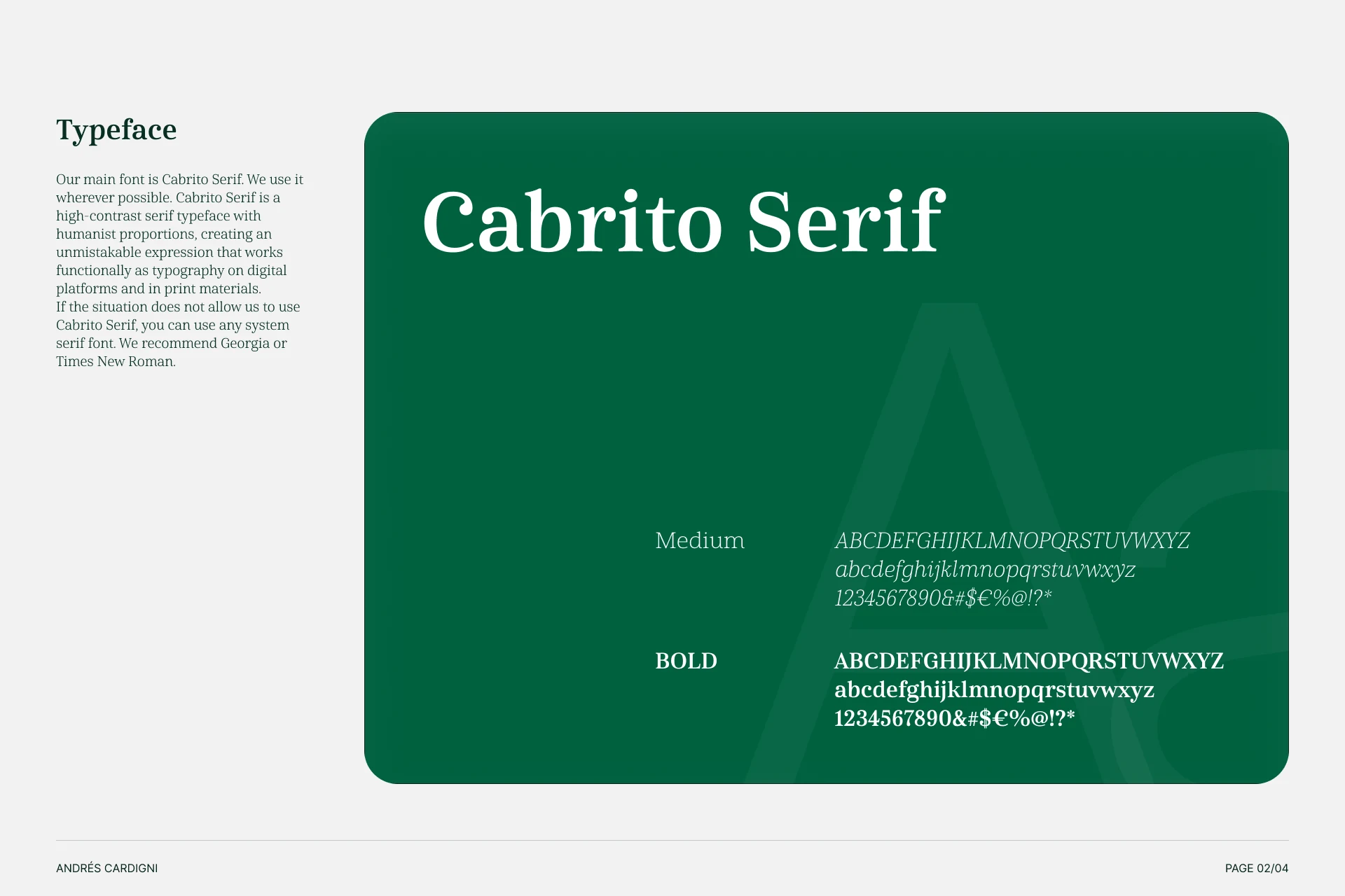
Emuná Blend needed to feel like an old-world apothecary reimagined for today — the kind of boutique European tea brand that treats its ritual seriously, without falling into the surface-level clichés common in wellness packaging.
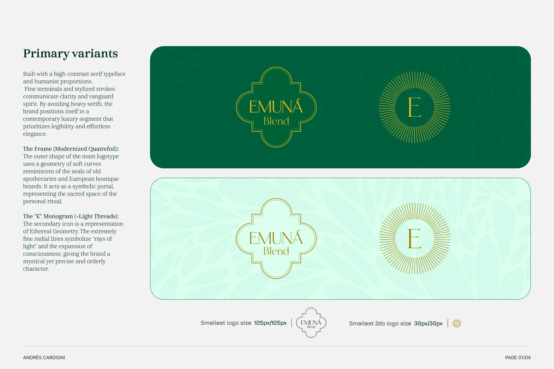
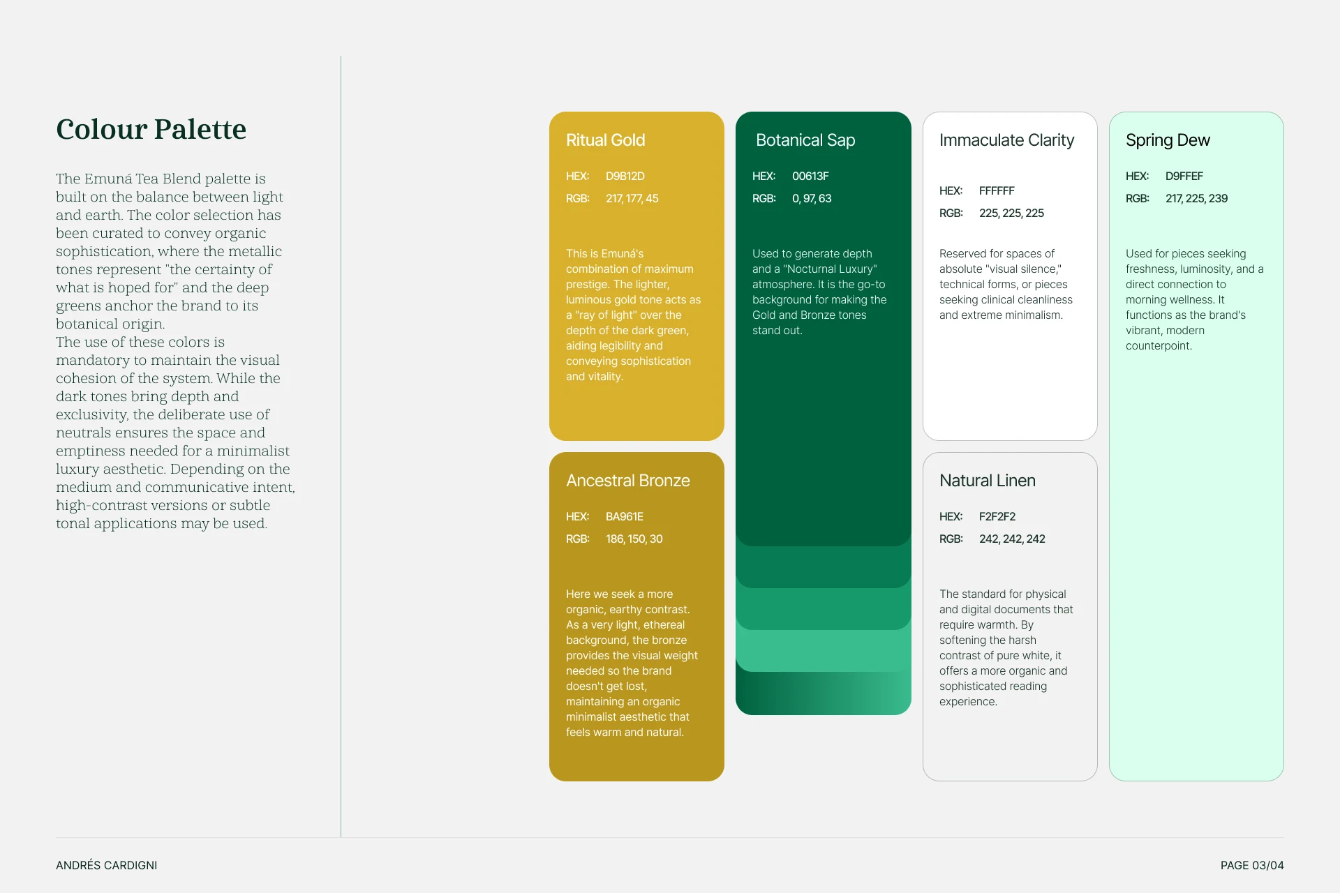
I developed the full identity and packaging system around a symbolic "portal" — a modernized quatrefoil frame wrapping the logotype, meant to read as a threshold into the personal ritual of tea. Typography was a high-contrast humanist serif, chosen to project both institutional authority and artisanal warmth. The palette centered on forest green with gold detailing.
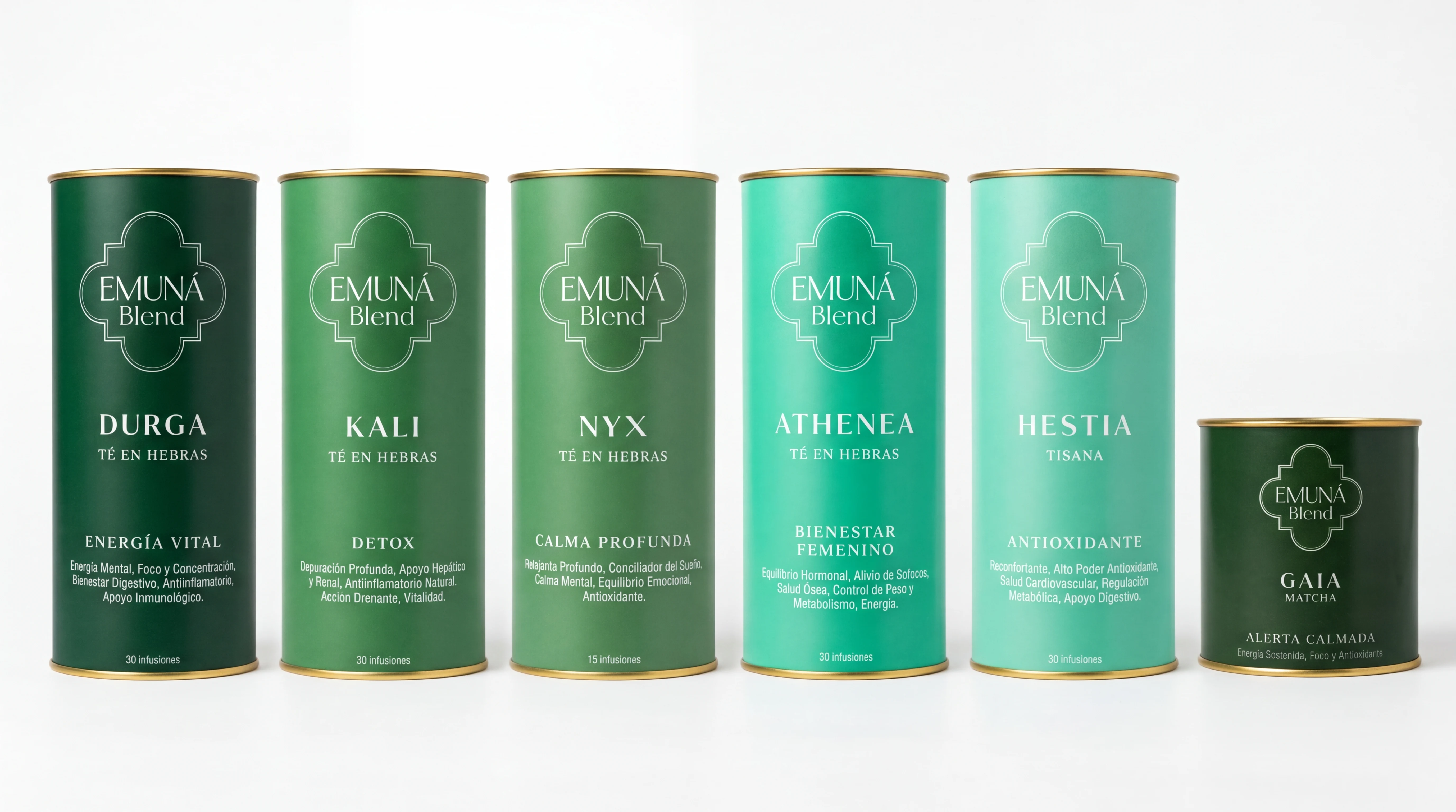
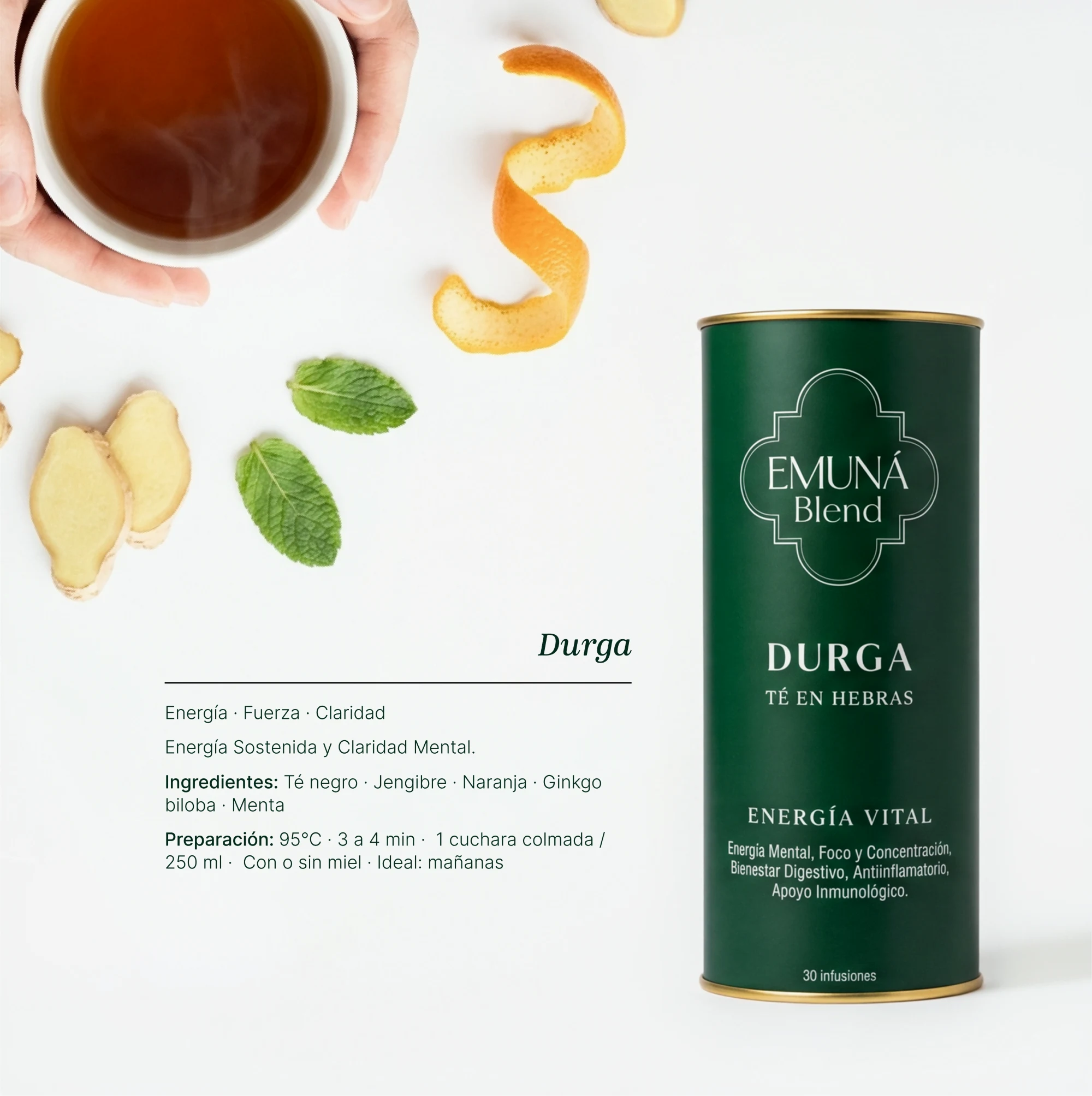
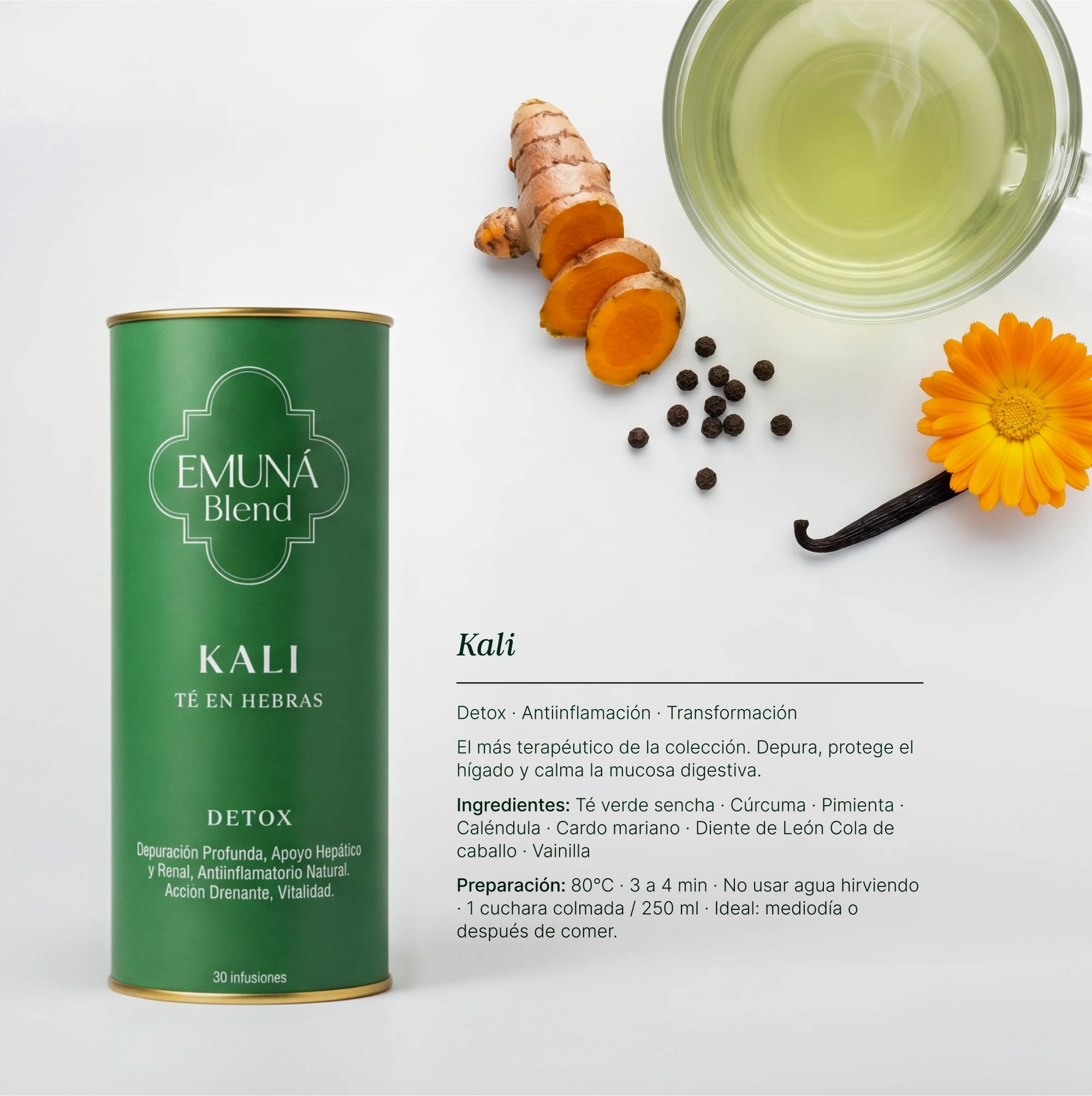
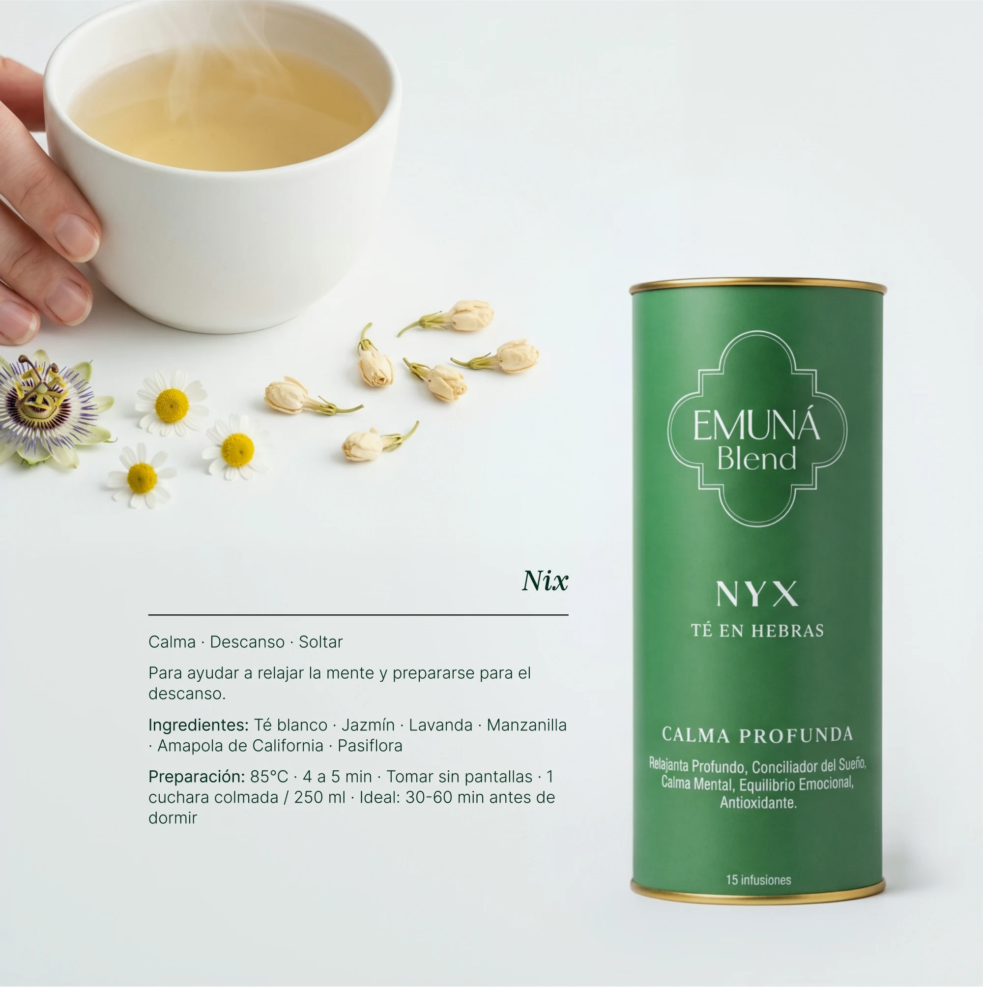
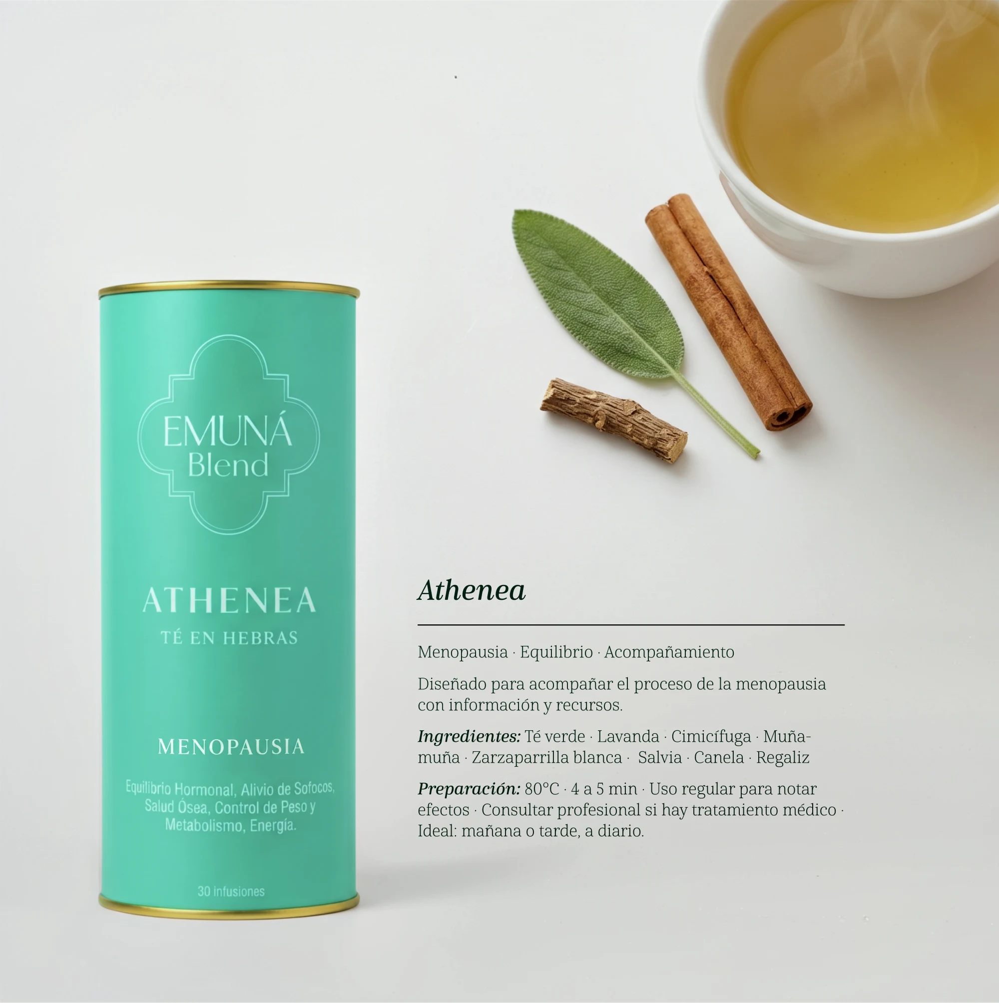
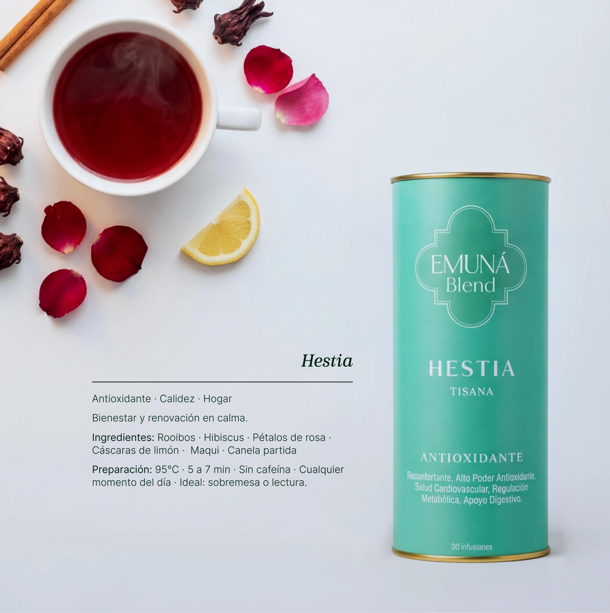
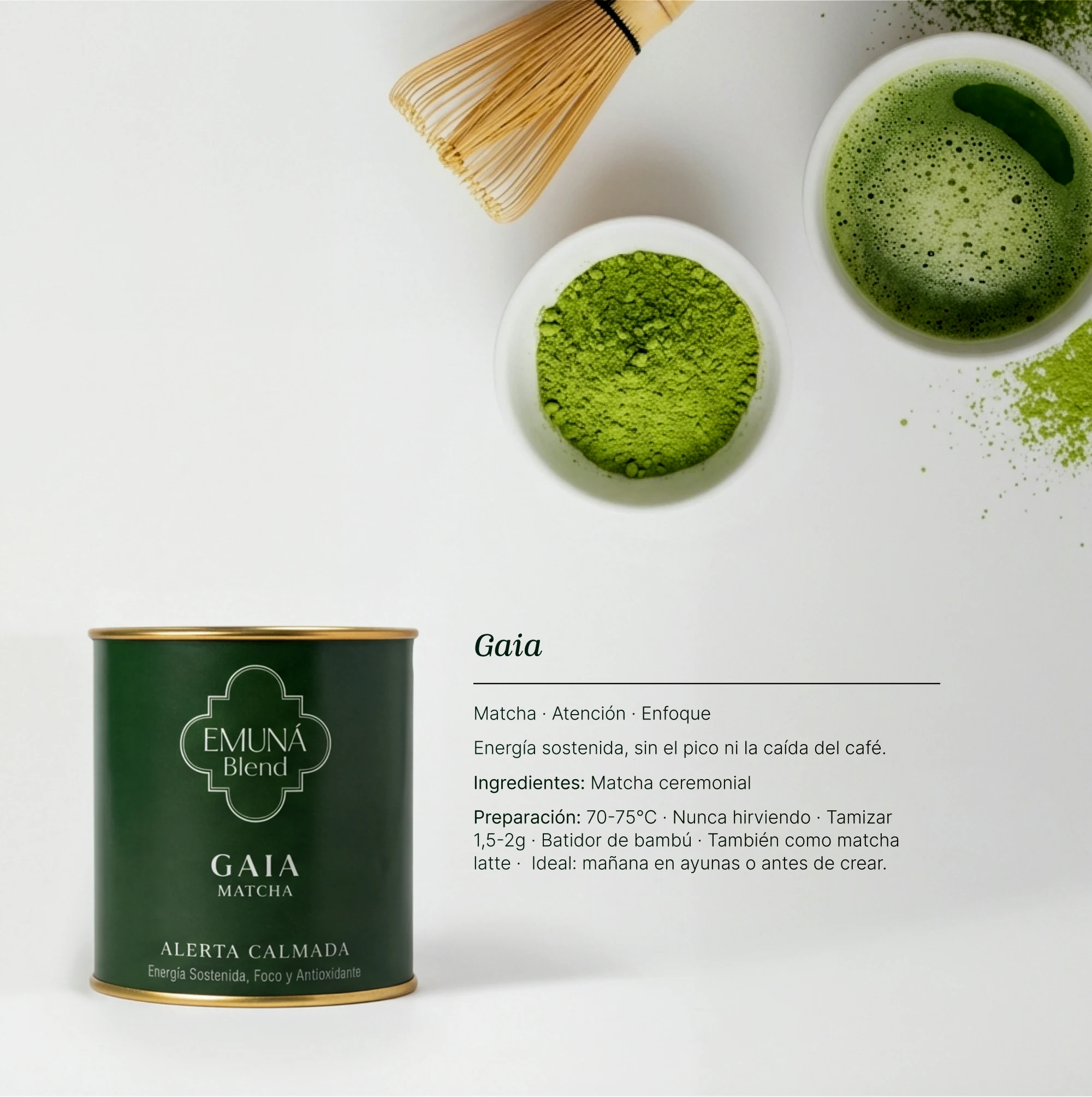
The product line covers six blends, each with its own formula and ritual: Nix (white tea, jasmine, lavender, chamomile, California poppy, passionflower — calm), Durga (black tea, ginger, orange, ginkgo biloba, mint — energy), Hestia (rooibos, hibiscus, rose petals, maqui, cinnamon — antioxidant), Kali (green tea sencha, turmeric, pepper, calendula, milk thistle, dandelion, horsetail, vanilla — detox), Athenea (cimicifuga, muña muña, sarsaparilla, sage, cinnamon, licorice, lavender, green tea — hormonal balance), and Gaia, a ceremonial-grade matcha with its own whisking ritual.
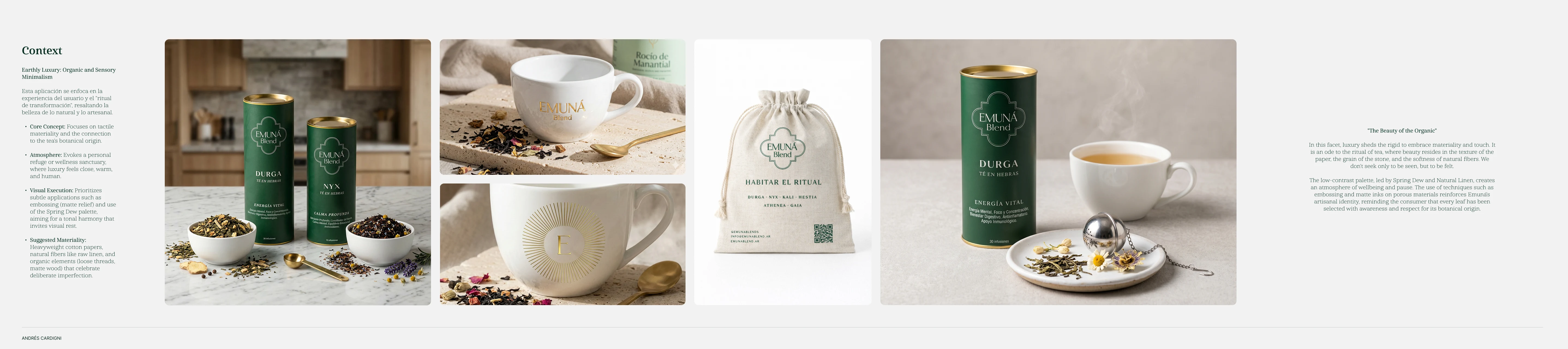
Six different blends, each with its own net weight and a different amount of air inside the tube (from 16% to over 44%), had to share one coherent packaging language without inflating costs. The work was finding the right measurement: a tube size that worked for the budget, for each blend's weight, and for what production could sustain.
We standardized the line into two die-cut structures instead of six custom ones: a Standard Tube (60mm diameter × 150mm tall) covering Nix, Durga, Hestia, Kali, and Athenea, and a Short Tube (60mm × 68mm) built specifically for Gaia's matcha, which needed less depth but a wider mouth for whisking. The packaging files were built in Illustrator and Affinity, and every delivery was rebuilt to the supplier's requirements: we changed print shops three times, and each one asked for different specifications.
Beyond the tubes, we designed a reusable canvas delivery bag under the concept "habitar el ritual" (inhabiting the ritual) — a central typographic stamp in forest green, clean sides left open for future branding applications, a structure adapted to the rigid deformation the tubes cause inside a soft bag, and an integrated QR code linking to a brand playlist, turning the unboxing itself into part of the ritual.
Browse the complete Emuná Blend catalog, page by page.
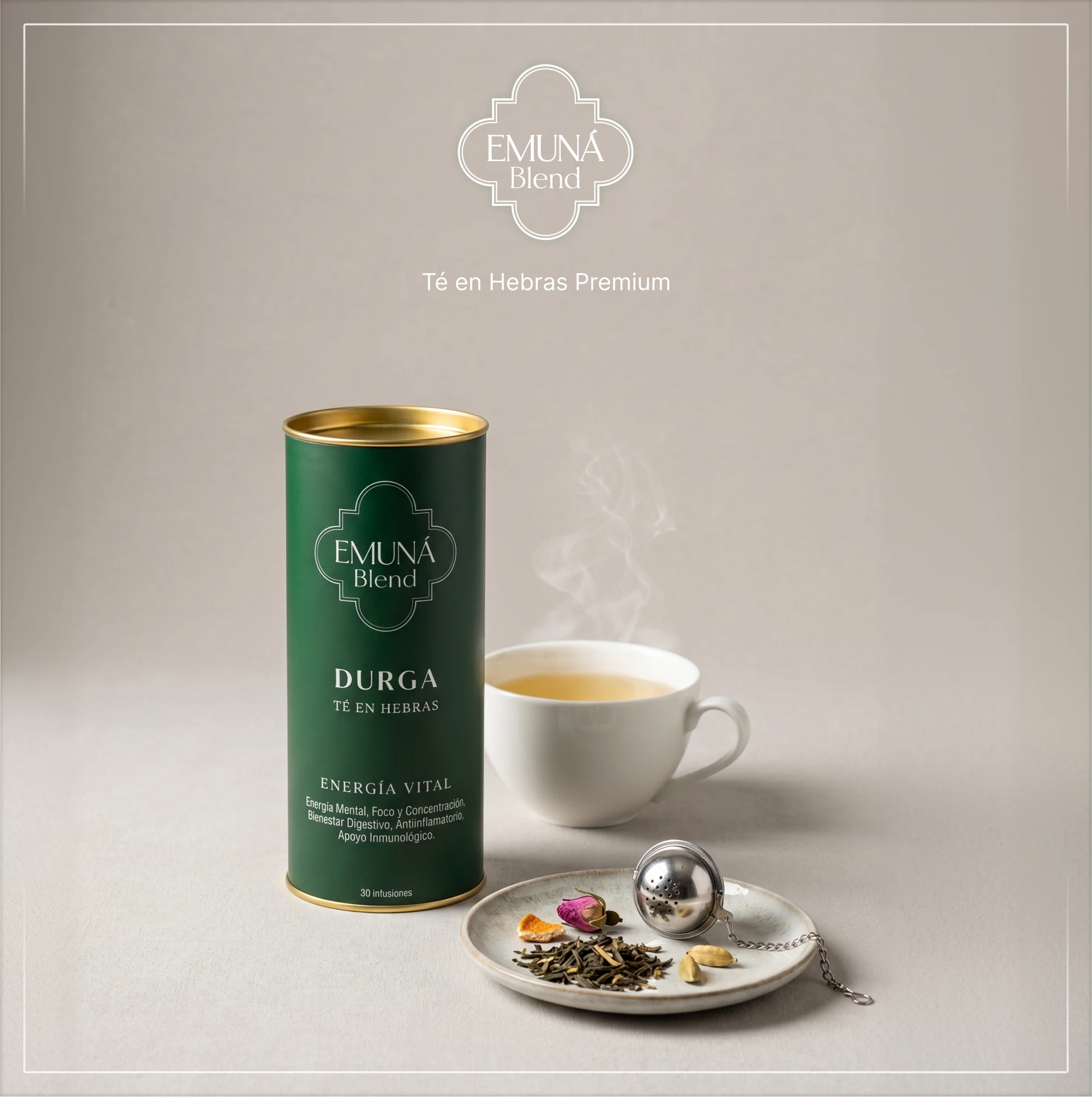
Page 1 of 10
A complete six-blend product line built on two efficient die-cut structures, a symbolic packaging system anchored by the quatrefoil portal, and a reusable canvas piece that extends the brand ritual past the moment of opening the box.
At Emuná I saw that premium packaging is a math problem dressed as craft. The sense of ritual — the portal frame, the weight of the tube, the deliberate slump of the canvas bag — had to be resolved inside a measurement that also had to work for budget and for production before any of it could feel effortless.