Fintech · Brand & Product Design
Rebit Wallet
Onboarding, Documentation, and the Product Behind the Brand
Onboarding, Documentation, and the Product Behind the Brand
Once Rebit had a brand and a design system, someone had to carry it into the product and make sure it held up — from the first onboarding screen to a documentation deck precise enough that no one downstream had to guess.
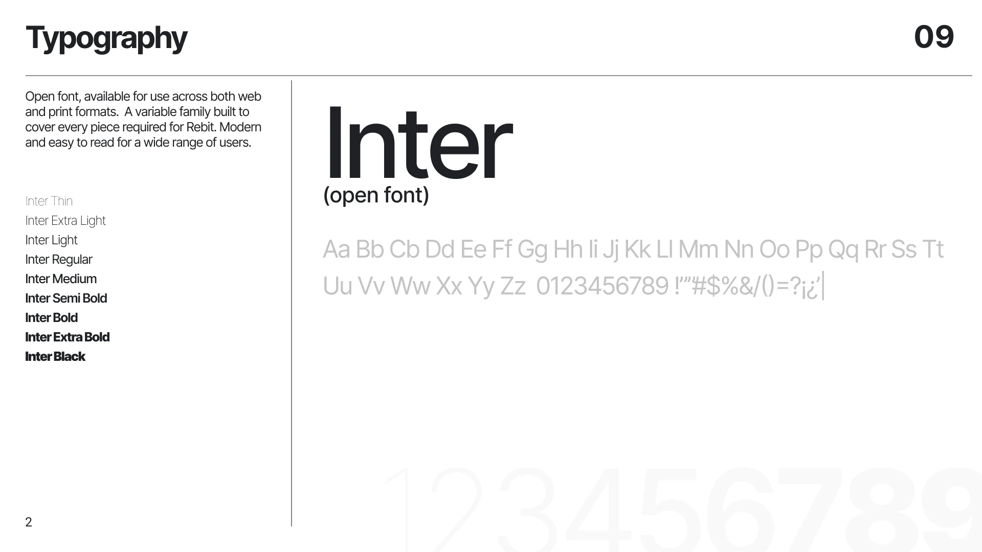
Beyond the interface work, I owned the complete brand documentation — typography, color system, iconography, and usage rules — built so that any designer or partner working with Rebit could apply the identity correctly without guessing. This ran in parallel with my work on the product itself: taking the wallet from a set of screens to a coherent, documented experience.
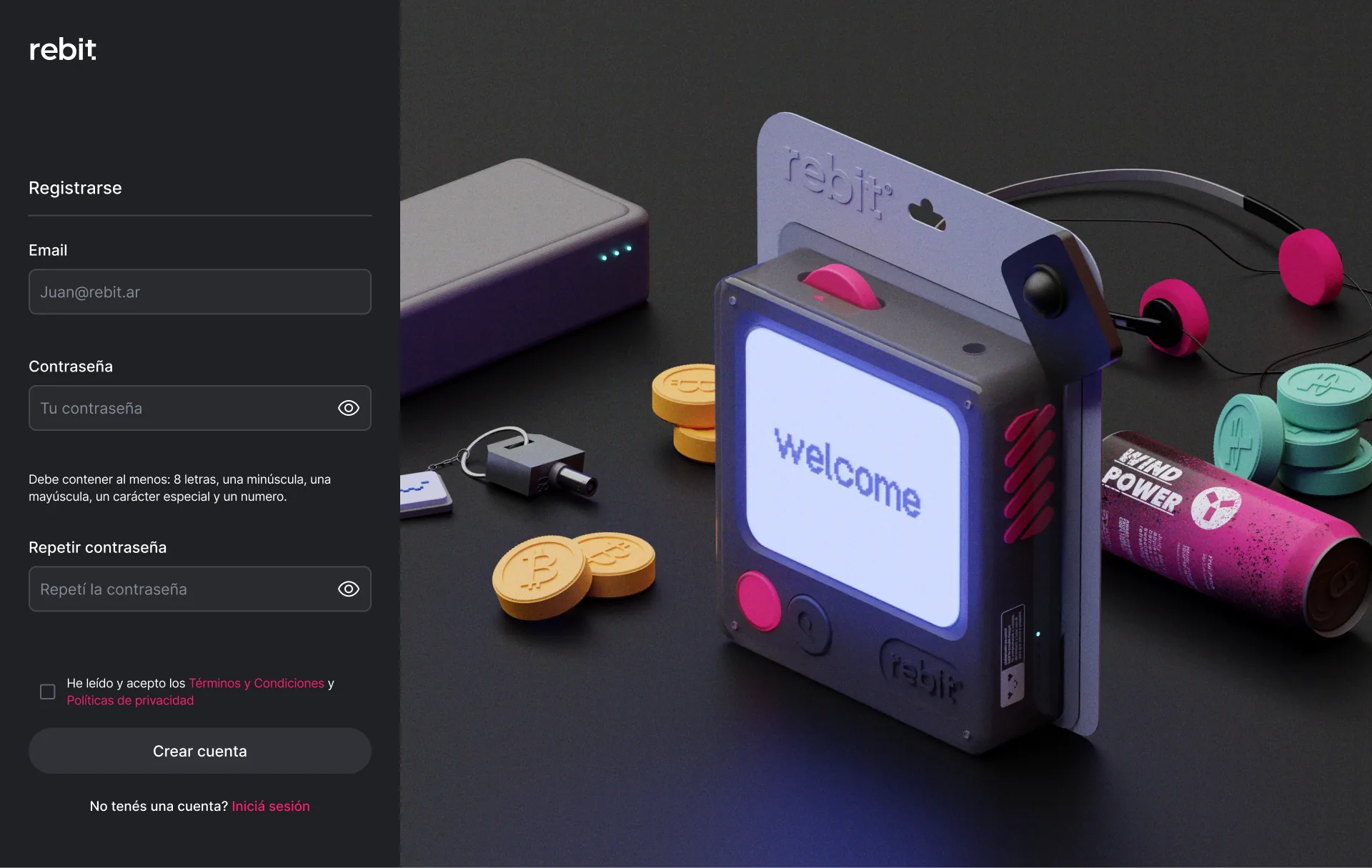
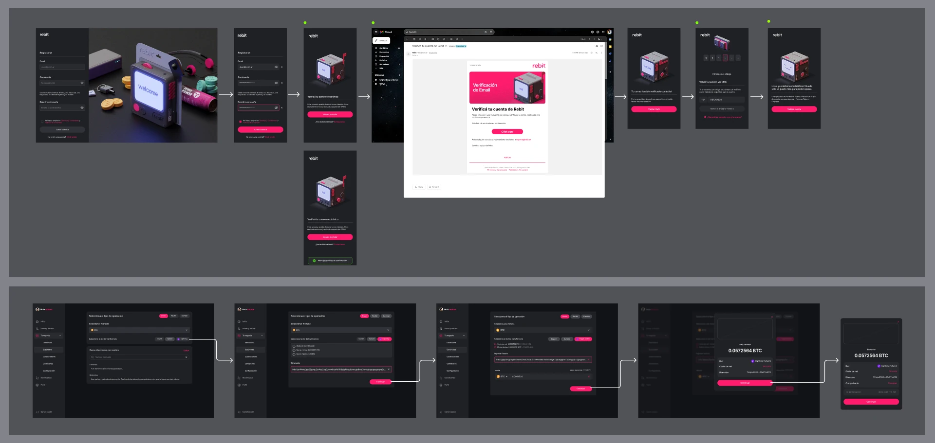
Once the interface existed, its highest-stakes flow — onboarding — had to feel secure without feeling hostile: registration, email verification, two-factor authentication, and password recovery all needed a system robust enough to survive being used by people who weren't in the room when it was designed.
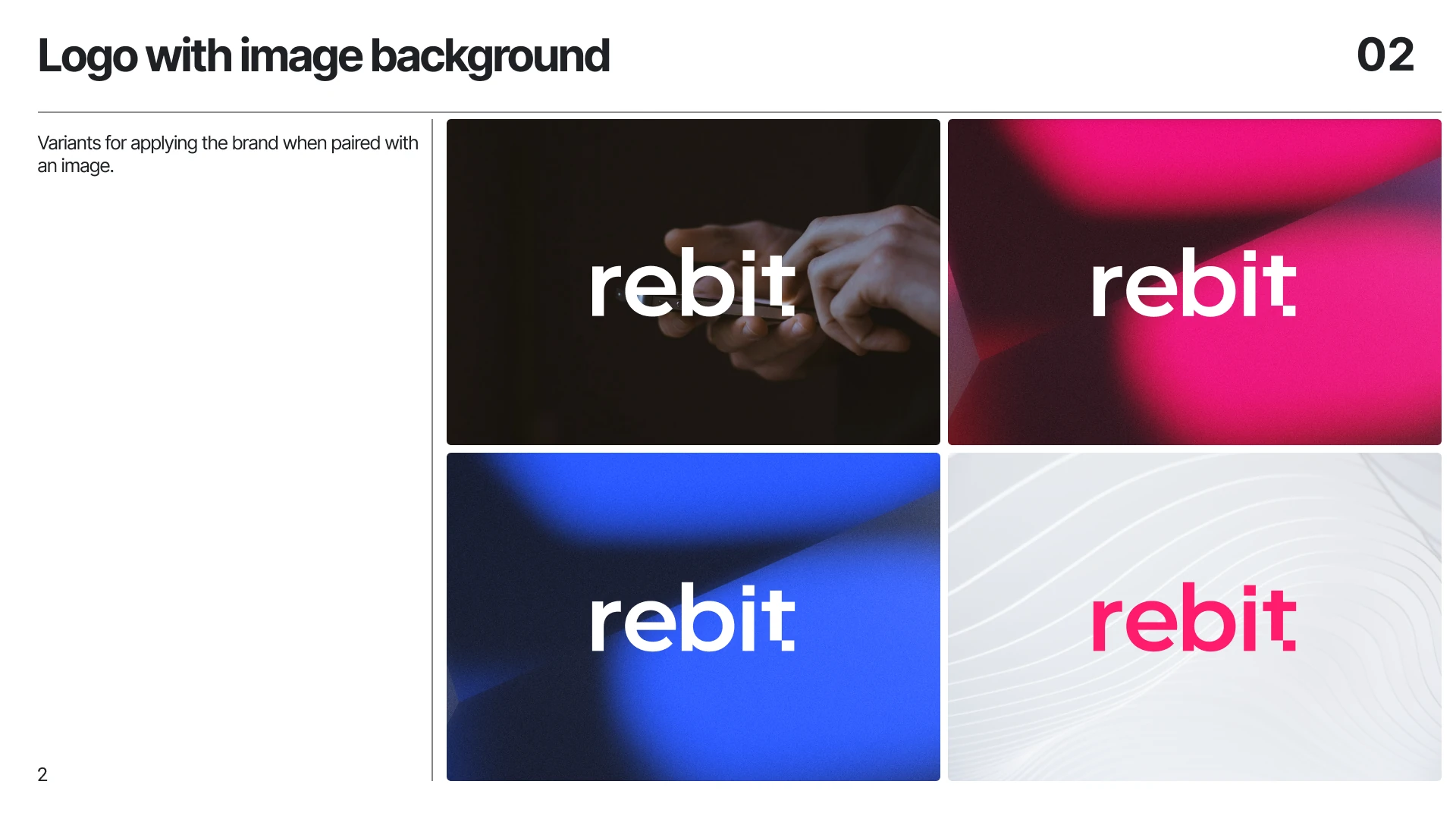
I mapped every onboarding edge case — verification, 2FA via SMS and Google Authenticator, password recovery, error states — before finalizing a single screen. In parallel, I built the full brand guideline deck: typography, color system, and usage rules for logo placement over photography. Documenting misuse cases mattered as much as documenting correct use.
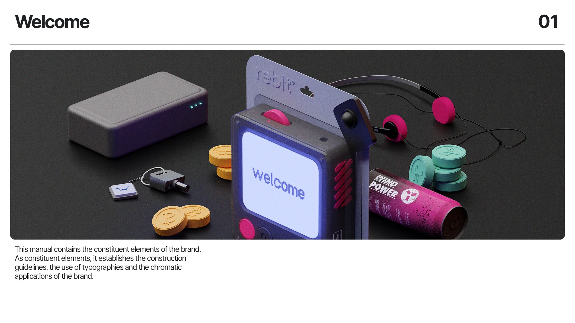
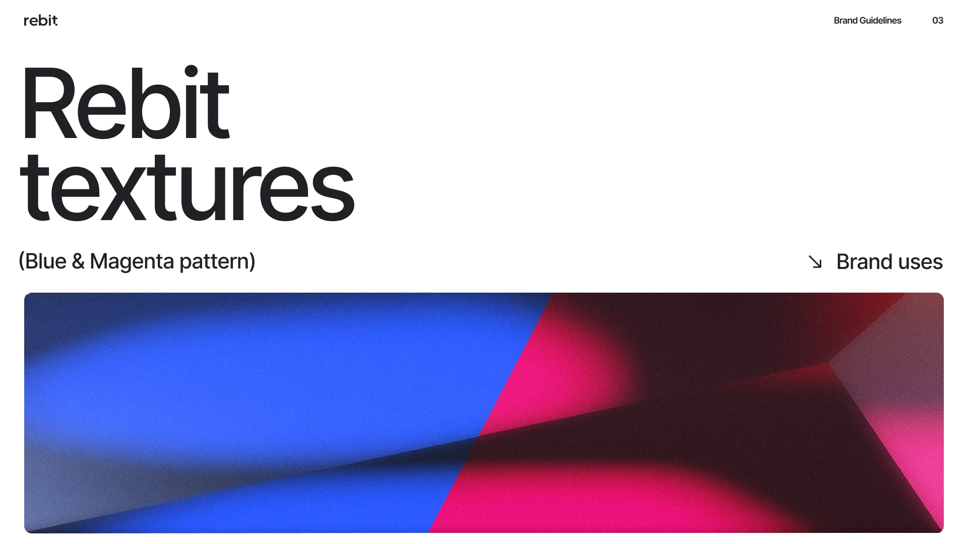
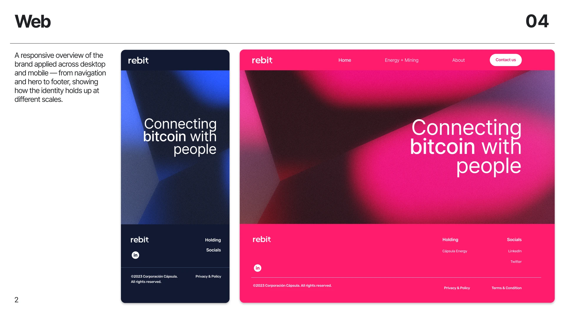
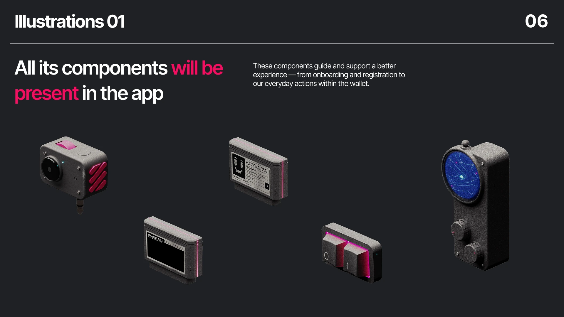
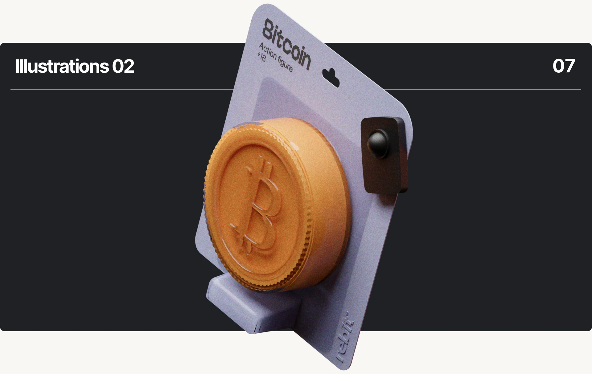
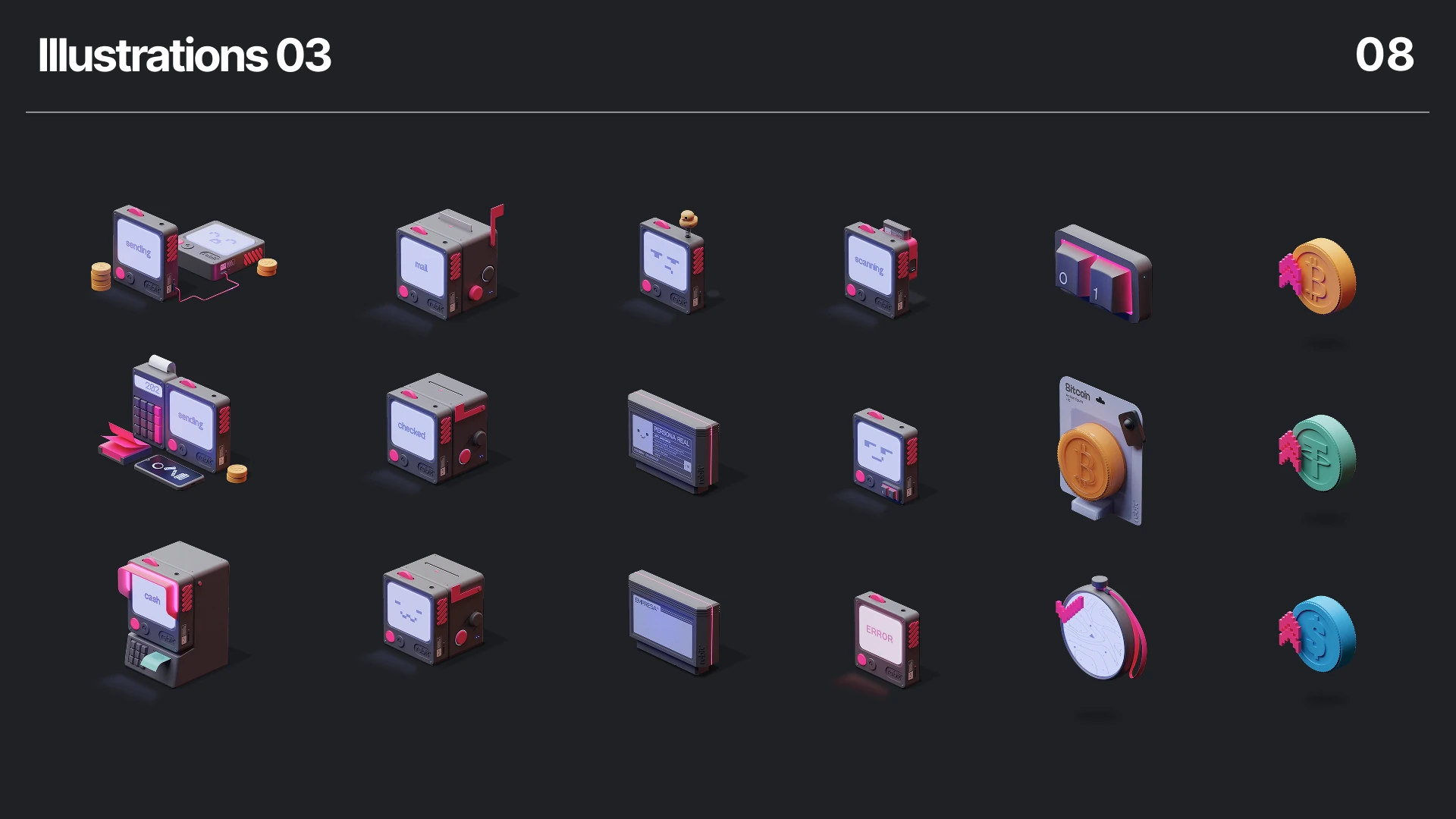
What follows are a few pages from the brand manual — they show how we set out to work the identity through graphic quality.
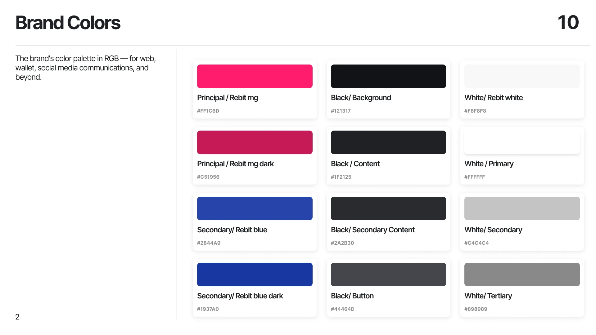
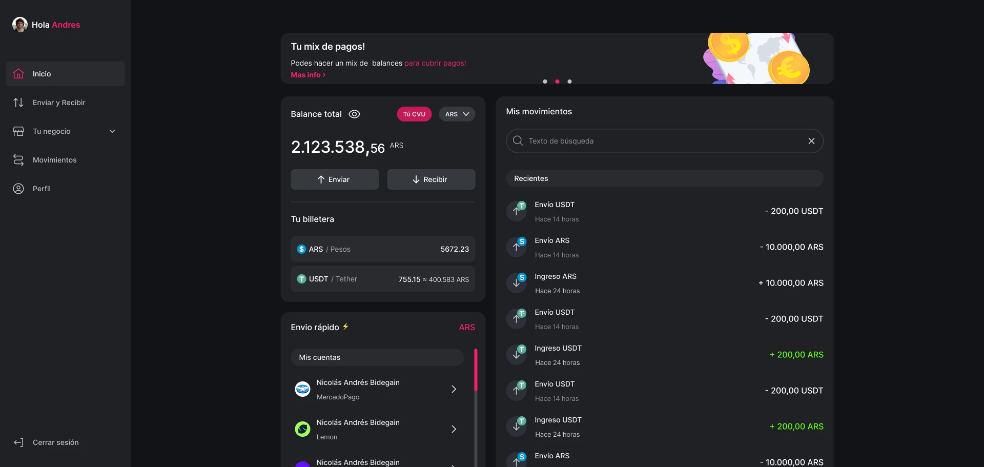
We shipped the full circuit to production — onboarding, home, sends, currency swaps and receives in ARS, USDT and BTC — backed by brand documentation precise enough that color values, logo placement and typographic use never had to be explained again.
In the wallet onboarding it showed that security and trust are a UX problem before a technical one — whether someone finishes setting up 2FA or drops out usually comes down to how clearly each step explains why it exists.